The red of the Turkish flag and traces of Anatolia met in the logo of COP31
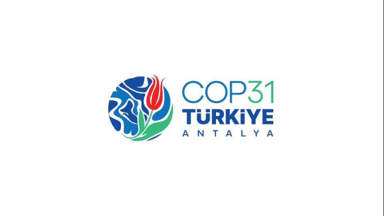
According to the information received from the Ministry of Environment, Urbanization and Climate Change, there is a round form in the center of the logo designed for COP31, representing the world, the common home of humanity.
This form draws attention to the borderless nature of the climate crisis and symbolizes that a solution is only possible with global responsibility and joint action.
The traditional art of marbling used in the logo reflects the delicate balance between nature and humans. The patterns formed on the water and existing in harmony by touching each other point to the mutual interaction in the ecosystem.
The tile touches in the logo, which bear traces of thousands of years of Anatolia's art and production culture, represent the traditional understanding of art that emerges from the masterful processing of the soil and the creative relationship between human labor and nature.
The tulip motif in the center of the logo stands out as one of the symbols of Anatolian and Ottoman aesthetics.
Tulip, used as a harbinger of rebirth, hope and spring, emphasizes that the climate struggle is also a call for renewal and rebirth.
The colors used in the logo also carry messages about the fight against climate change and Türkiye's hosting status. The blue color in the logo comes from water, which is the source of life of the planet, the green color comes from the sustainable future and the continuity of nature, and the red color comes from the flag of the host country, Türkiye.
Combining the concepts of nature, culture and global responsibility, the logo gives the message that COP31 is not only an international climate conference but also a call for solidarity for a common future.
Source: TRT Haber Açık RSS (Gündem) (Open Press / Translated Full Text)
💬 Yorumlar 0
Henüz yorum yapılmamış. İlk yorumu siz yazın!